For the 2008 season, it was clear we had to make some new banners. The ones we did for 2005 held up remarkably well, but it was time to retire most of them, as they referenced players no longer on the team, like Noonan. (Exception: We decided to keep the huge blue graffiti style one, because even though one of the taggers is wearing a Dempsey shirt, the banner’s huge and dramatic, and anyway fans are gonna be wearing Dempsey shirts to Revs games forever; we could’ve depicted a Moore shirt for the same reason).
This left us with a big question: What to do? We weren’t feeling as inspired as the 04-05 offseason; we had some banner blanks, plenty of leftover paint, and an offer of angel funding for more fabric, but no real compelling ideas were coming to light. We knew we didn’t want to do banners that were goofy pop culture references or obscure in-jokes that would go stale before the All-Star Game, and, much as we might like to push the envelope a bit with scarves or one-shot paper banners, they had to be general audience themed, something the kids in the midfield would dig as much as the clowns in the Fort. Magpie mentioned how much he loved how the Joe-Max Moore tribute banner turned out, and then, one day while at the gym, it hit me.
“FIERCE”
“Hey, can you get me a photo of Shalrie where he looks really intense, like he’s gonna rip someone’s head off?”
Magpie sent the photo, and I got to work. “What do you think?” I asked.
“I fucking love it.”
Originally, it was just gonna be Shalrie, but we got to thinking, and it ended up being all the returning vets, plus Albright, plus Nicol and Mariner. The words were all one syllable terms we felt best described the person and what he brings to the team, in most cases with several possible meanings. Magpie came up with some of the words and dug up about half the photos, and I did the rest over the course of a month. Each banner took about three hours to paint, with an afternoon or two set aside to sew the fabric (donated by Mara) and trace from an LCD projector. I used nylon web for the straps instead of extra canvas, which cut down on the sewing time quite a bit, and the snaps are color coded according to player position.
The more I worked on them, the more excited I got by the project. Here we had banners that were spirited enough for the Fort, but positive enough for the midline sections, so everyone could enjoy them. No references, in-jokes, or themes that have a sell-by date. They’re all separate, so they can be shifted around the stadium as needed, rather than blocked into one specific section. If someone leaves the team, we can just retire his banner; conversely, if any of the draftees or new signings makes some noise from the opening whistle, it’ll be a snap to add additional banners. Best of all, we figured the players will flip over these, like they did the pumpkins in 2005.
The banners (if they look a little weird at this distance, remember they’re meant to be seen from about thirty feet away):
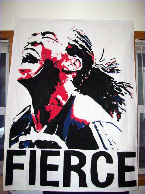
Shalrie Joseph, “FIERCE”: The one that started it all, and one of my favorites.
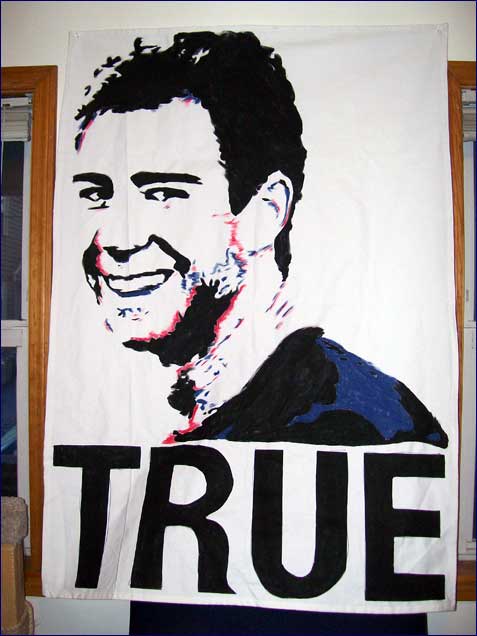
Steve Ralston, “TRUE”: This one is my favorite. If there is a better photo of Ralston out there, I haven’t seen it–it just captures the guy’s personality and presence perfectly.
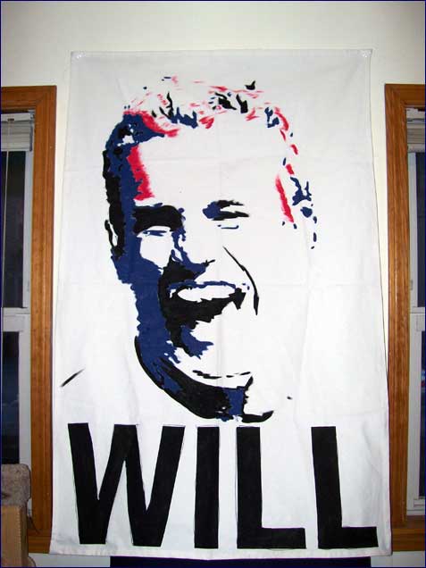
Taylor Twellman, “WILL”: Mike Toole thought this one up. This was the first one I painted, and I ended up going back and redoing it to make it stand out more.
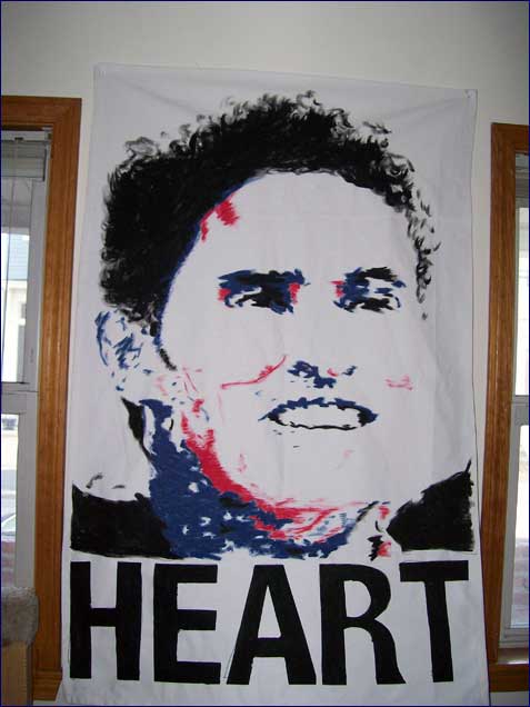
Jay Heaps, “HEART”: Something about how this one turned out kind of bothers me, but it’s still good. Photo is of him applauding the audience after a game, appropriately enough.
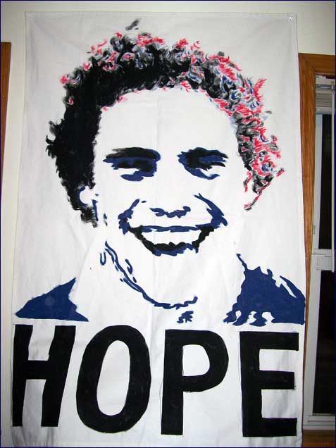
Chris Albright, “HOPE”: The only one of the “new guys” to get a banner, because we’re familiar with his previous work. I love the hair.
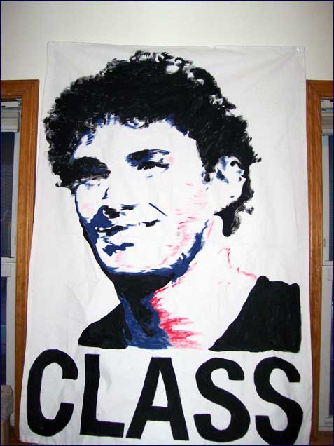
Michael Parkhurst, “CLASS”: What more can you say about the guy?
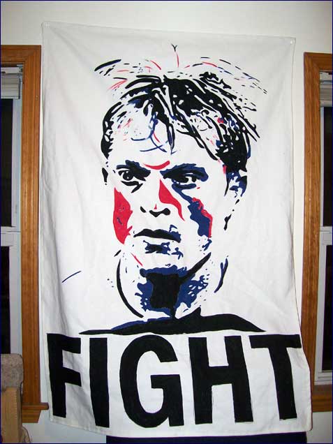
Joe Franchino, “FIGHT”: Welcome back to the lineup, Joey.
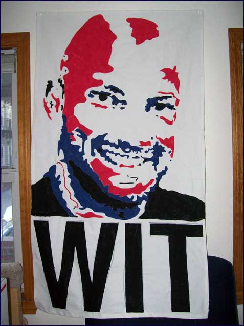
Matt Reis, “WIT”: The large patches of red look a little weird, but it was either that or his head would fade into the background entirely.
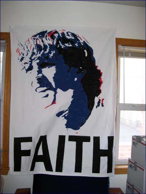
Wells Thompson, “FAITH”: Used up almost all the blue paint.
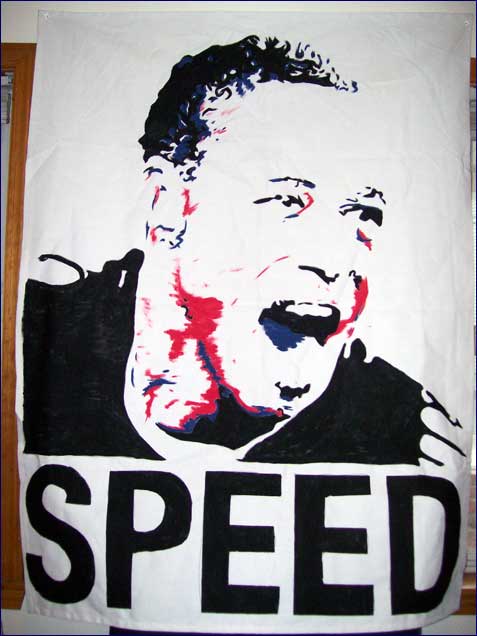
Khano Smith, “SPEED”: The image is after his 2005 playoff “Are you kiddin’ me” goal.
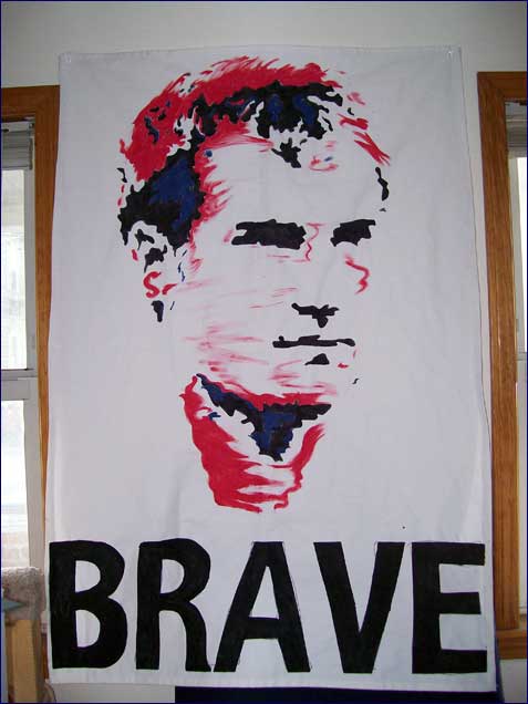
Jeff Larentowicz, “BRAVE”: Guys with lighter-colored hair (or no hair) were harder to do than guys with darker hair, as when bumping the contrast/brightness to get the images ready, they’d nearly disappear.
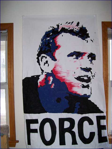
Adam Cristman, “FORCE”: We kept thinking his word should be “CHIN.”
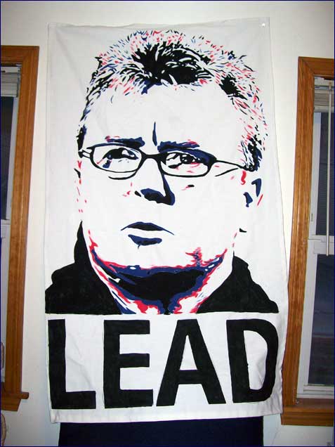
Steve Nicol, “LEAD”: I love how the eyes turned out.
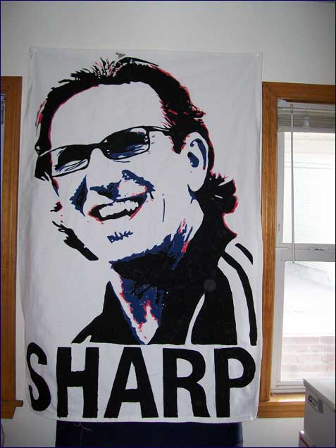
Paul Mariner, “SHARP”: Nicol looking serious worked, but we felt Mariner had to be smiling. Just perfect.