Before a soccer match, it’s traditional for the team captains to engage in a little gesture of sportsmanship: They shake hands, pose for a photo, and exchange small pennants, usually printed with their team’s name and sometimes the match date, opponent, venue, and competition. After the exchange, the captain heads to the sideline and hands the pennant to the equipment manager, who gives it a quick glance before stuffing it in a suitcase and taking it back home.
From my seat behind the away bench at Revs games, I got a good look at the pennants the team was handing out last year. Printed with only the team name and logo, I found them a bit lacking. Inspiration struck and I emailed the team staff.
“THESE PENNANTS ARE BORING. I’MA DO THEM NEXT YEAR.”
And so began a season-long project to make a different pennant for each Revolution home game in 2015.
As a team sponsored–I am reimbursed for materials and a jersey–project, there were a few more ground rules than I usually have. Each pennant had to be approved in advance, mostly by sending a template illustration before committing to fabric. Each had to have both team names, logos, and the new MLS logo. (Gotta say I wasn’t a fan of the new MLS logo until I had to paint it every week, at which point its lack of tiny fussy details simplicity won me over). Fun as it would be to use older logos on other original ’96 teams, I had to use the current logos and color schemes, although I accidentally used an older version of Real Salt Lake’s. The materials couldn’t be too expensive or unwieldy; a proposal to honor the 20th anniversary of the league/team by giving a traditional 20th anniversary gift–china–was nixed. Lastly, the pennants had to be something appropriate for the opposing team captain to hold for a photograph, and that would be by their standards, not mine, eliminating the chance of Bobby Boswell holding a pennant reading “I AM A GARBAGE PERSON WITH GARBAGE IDEAS.”
Initially, I wanted to use this as a chance to work with themes and media I’ve always wanted to use but haven’t been able to work into a banner for reasons of cost, size, or space. That didn’t quite work out, as time prevented me from getting into things like silk painting or batik. I did get to do a linoleum print and work with handmade wool felt, at least. All the rest were the usual paint on canvas works I usually do.
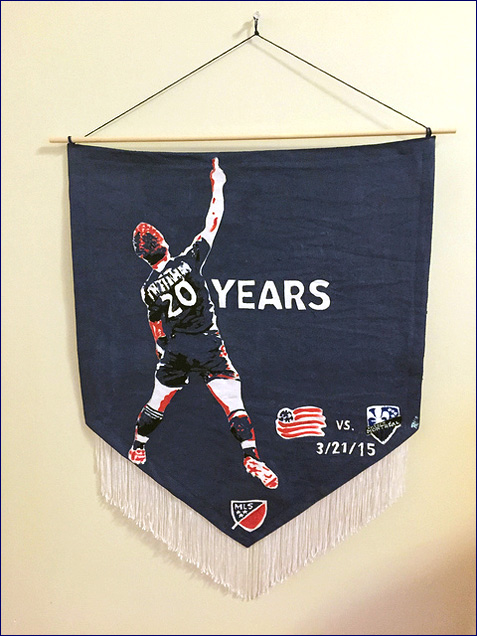
#1: 20th anniversary season opener, and there’s only one thing that comes to mind when you say Revs and 20.
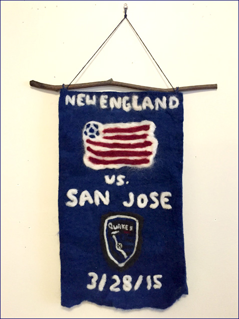
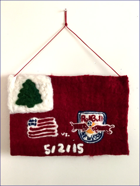
#2: First of the wool felt. A friend gave me several pounds of New Hampshire wool roving, so I dyed it and turned it into felt via wet felting and needle felting. The background is wet felted, where you rub soapy boiling water over the fiber until it locks up into fabric. The foreground is needle felted, where you punch the fibers with a barbed needle until they look like the design you want. As an added local bonus, the stick holding this up was taken from a sycamore tree in the Gillette Stadium parking lot.
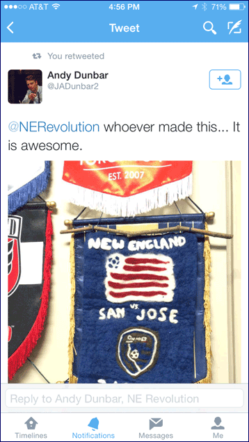
We got some feedback on that one.
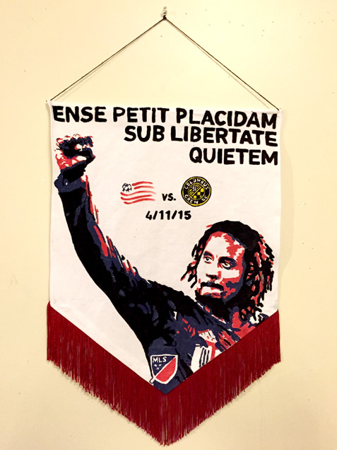
#3: First of a series of all six state mottos. “By the sword we seek peace, but only under liberty,” the MA motto. Jermaine Jones on this one because a take no prisoners USMNT midfielder seemed a good match, plus the source photo is from the last time Columbus played here.
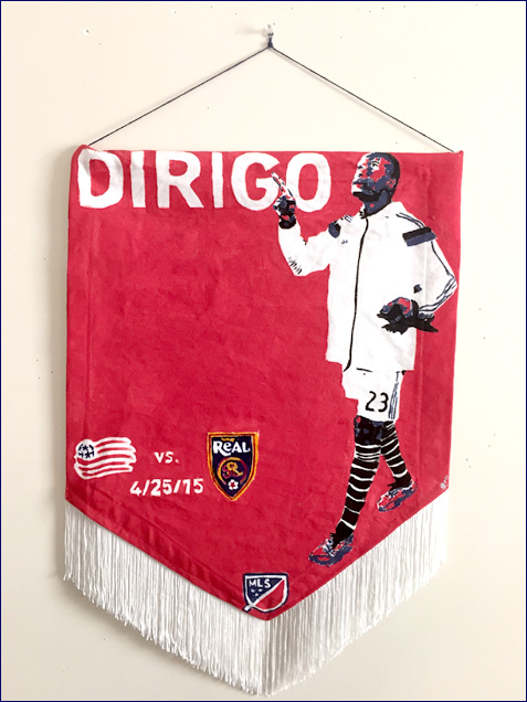
#4: Maine, “Dirigo.” “I lead,” featuring a photo of Jose Gonçalves leading the team on to the field, even though he was on the bench for that game and did not lead the team to the field.
#5: Second of the felt ones and first made to a team-requested theme. This one’s got the New England flag as background to celebrate the first time the team wore its popular flag-themed red alternate jerseys at home.
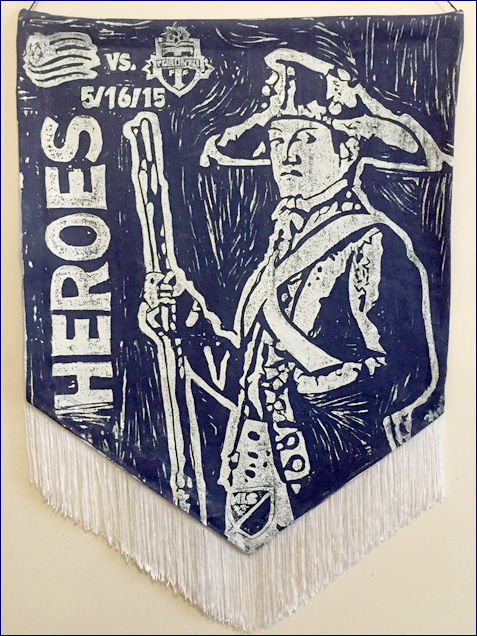
#6: Salute to Heroes featuring Deborah Sampson, official heroine of Massachusetts. Sampson dressed as male to fight in the Revolutionary War, then spent rretirement fighting for a pension, and I imagine she would be displeased to learn fighting for benefits continues to be a going concern for modern vets. The idea that the battle ain’t over even once the troops are home, that resonated with me, so I chose a hero who fought it all. Pennant is a linoleum print, which was surprisingly easy to carve once I worked out how to transfer the design. Pulled four–one for each team, one to donate to the local USO, and one the team sold at a charity auction.
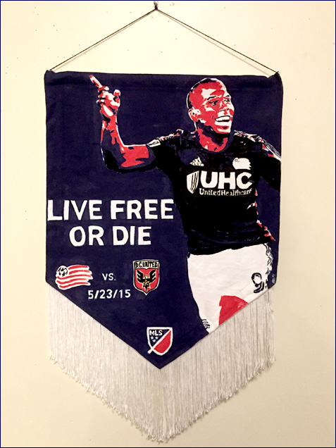
#7: New Hampshire’s state motto, as represented by native son Charlie Davies, who a) did come pretty close to dying b) used to play for the evening’s opponent.
#8: The motto of the State of Rhode Island and Providence Plantations, as represented by Lee Nguyen, who was suspended for that night’s game.
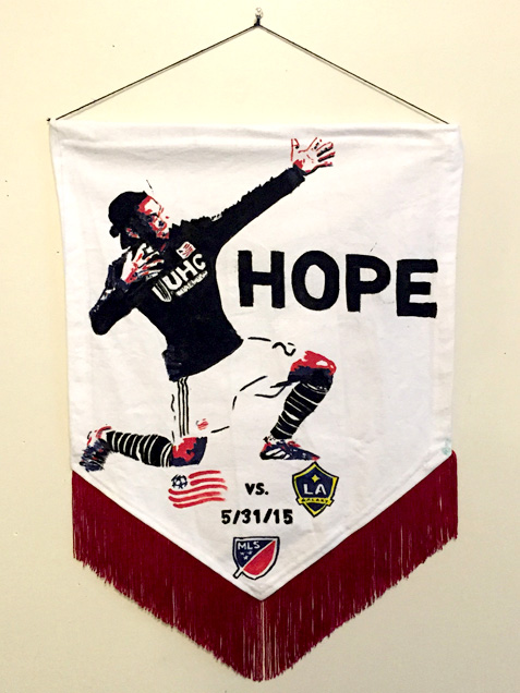
#9: Pride Night–six states, one wicked proud team. No slogan needed, just fans. Best part is the person looking up at the lower right corner of the pride flag.
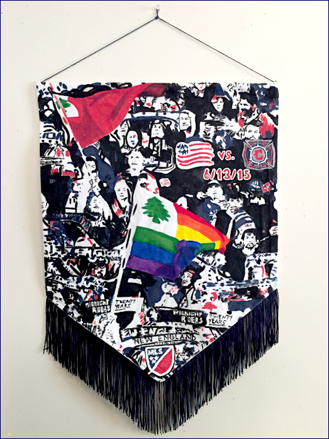
#10: “He who transplants sustains,” the state motto of Connecticut, introduced by Andrew Farrell and the Fort as seen in Red Bull Arena. I wanted to have the fans holding the slogan, but it was too hard to pull off, so on the ad boards it went.
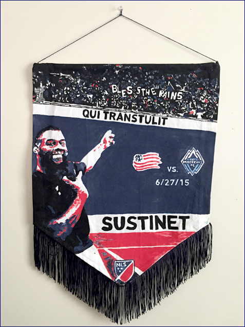
#11: Closing out the state motto series, it’s Bobby Shuttleworth doing a barrel roll under the Vermont motto.
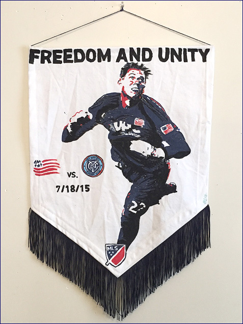
#12: Despite watching that week’s MLS All-Star Game from a couch like the rest of us clowns, Chris Tierney made the roster, a Massachusetts all-star with the radio on. I wanted to do that week’s pennant featuring Jay Heaps, because his birthday is the following day, but…
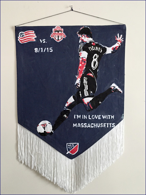
#13: …the team planned a Jay Heaps bobble head night for the next game, so we got the Jay pennant on my birthday instead. This one’s my favorite so far, because it’s very silly, very New England, and worked incredibly well once I found a good recent source photo where Jay’s facing the camera. Congratulations to the Dynamo for having the hardest logo to paint at 2″ square. If at all particular, choose New England.
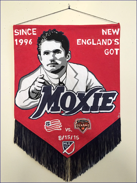
#14: For the second of our home games vs. one of the new expansion teams, I went with an original ’96er theme: Mike Burns. Why Burnsie and not, say, Lalas? Burnsie’s still with the team, New England to the core, but mostly because he was our representative in THAT photo of all the original teams with their original painfully 1990s jerseys. The slogan is from an R.E.M. song that I’ve been wanting to work into a piece for years–guess you could say I looked for it and I found it.
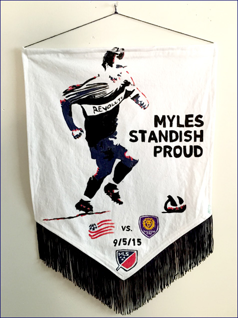
I’ve got three left, plus any playoff games, and, if the team will have it, I’d love to continue this next year and use some of the concepts and media I didn’t get to work with. Maybe I’ll finally get to do that batik.