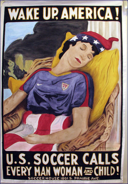
This is what I was working on in the Training Camp photo series. It’s a WWI poster, retooled for US Soccer, and I’d had it on the drawing board for over a year before the Mexico WCQ presented itself as the best time to make this.

The concept lends itself to all three US programs (men, women, youth) even if Columbia is wearing specifically a WNT away jersey. (I originally wanted it to be an MNT away kit, but that was when I thought they were going to be navy blue, not grey). I bumped up the color of the pillow behind her to bright yellow to get more contrast with her skin and jersey, which I think turned out great. You can see a side-by-side of the source material with the banner version here.
Oh, yeah, about her skin and hair color–what I was kinda going for here was “ethnically indeterminate.” At national team games, I stand next to fans who are black, Latino, Asian, Native American, mixed race, etc., and I’m cheering on players who are themselves black, Latino, Asian, Native American, mixed race, etc. Why not, then, make Columbia look a little more like them? For skin tone and facial reference, I used Angela Hucles; I’m gonna try to get her to autograph this at a Breakers game this season.
This is entirely done with fabric paint, just different shades mixed with water and extender to blend colors on the fly. (Buying all those paints on sale before the 2006 World Cup was a fantastic investment). Even though it’s at the stage now where I look at it and can see all the errors I made, I love how this turned out. Finished size is 4’x6′, and from sewing to heat-setting the paint, I think it took a little over 20 hours. I just hope the weather in Columbus this week doesn’t mess it up too much, because I’ve had it tacked to my dining room wall for a week now, and I’m inclined to keep it there when it’s not in service as a banner.